Building the Bit Solutions brand
Bit Solutions has had the same logo since the company launched in 2008. It was a logo they felt proud of, designed in house by a member of the team, and they believed that it had served the business well. However, after continued business growth and change, Managing Director Sam Prior started to reflect on whether the visual brand matched the company’s future plans.
In partnership with a local design agency, they decided to take a closer look at the Bit Solutions visual identity, marketing and branding, and seek advice on how to move the brand to a position where it showcased the business to those who did not yet know the company and its people.
Why re-brand
After an initial conversation with Sam, it became clear that he was concerned about the strength and impact of the company’s current visual identity and whether it truly represented a modern and thriving business.
In a fast paced growing and successful company, with great client testimonials, it can be easy to overlook the external identify of your brand. However, part of the success of Bit Solutions, has been the continuous desire to improve and innovate, but the visual brand just didn’t shout about it.
Creating a new brand
The re-brand process started with a Brand DNA session involving the whole team at Bit Solutions. The initial session focused on gaining a deeper understanding of what had made Bit Solutions a successful company and how it intended to replicate this success in the future. The result was a clearly focussed Vision and Mission statement to guide the company’s direction and keep the staff focussed on what was important to the business. With a fuller understanding of the company the re-branding project began, and alongside it the design and build of a new website.
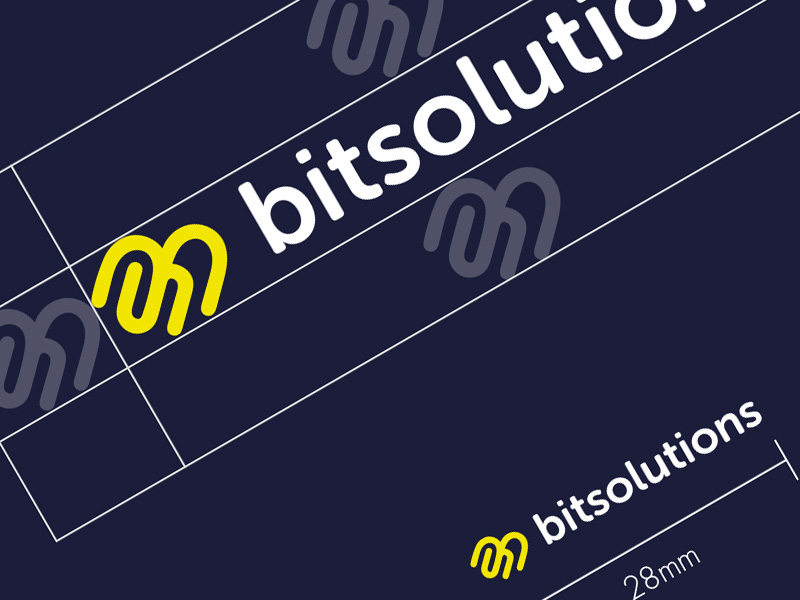
The focus was on creating a new visual identify to represent the company. We retained the company name, kept, with alterations, the dominant blue of the brand and introduced a new font, logo element and supporting brand palette and brand elements.
The result; a modern feeling logo, font and vibrant and engaging colours. With a supporting colour palette and logo elements the brand was ready to start shouting about its presence and do some heavy lifting on behalf of the company.